Portfolio
classwork for bimm143
Class 7: Machine Learning 1
Eric Wang (PID: A17678188)
Background
Today we will begin our exploration of some important machine learning methods, namely clusterring and dimensionality reduction.
Let’s make up some input data for clustering where we know what the natural “clusters” are.
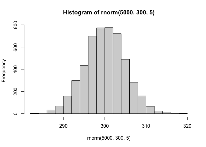
The function rnorm() can be useful here.
hist(rnorm(5000, 300, 5))
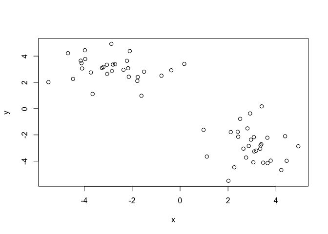
Q. Generate 30 random numbers centered at + 3 and -3
tmp <- c(rnorm(30, 3), rnorm(30,-3))

x <- cbind(x= tmp, y=rev(tmp))

plot(x)
K-means clustering
The main function in “base R” for K-means clustering is called
kmeans() :
km <- kmeans(x, 2)
km
K-means clustering with 2 clusters of sizes 30, 30

Cluster means:
          x         y
1  3.040158 -2.823266
2 -2.823266  3.040158

Clustering vector:
 [1] 1 1 1 1 1 1 1 1 1 1 1 1 1 1 1 1 1 1 1 1 1 1 1 1 1 1 1 1 1 1 2 2 2 2 2 2 2 2
[39] 2 2 2 2 2 2 2 2 2 2 2 2 2 2 2 2 2 2 2 2 2 2

Within cluster sum of squares by cluster:
[1] 72.00178 72.00178
 (between_SS / total_SS =  87.7 %)

Available components:

[1] "cluster"      "centers"      "totss"        "withinss"     "tot.withinss"
[6] "betweenss"    "size"         "iter"         "ifault"
Q. What component of the results object details the cluster sizes?
km$size
[1] 30 30
Q. What component of the results object details the cluster centers?
km$centers
          x         y
1  3.040158 -2.823266
2 -2.823266  3.040158
Q. What component of the results object details the cluster membership vector (i.e. our main result of which points lie in which cluster)
km$cluster
 [1] 1 1 1 1 1 1 1 1 1 1 1 1 1 1 1 1 1 1 1 1 1 1 1 1 1 1 1 1 1 1 2 2 2 2 2 2 2 2
[39] 2 2 2 2 2 2 2 2 2 2 2 2 2 2 2 2 2 2 2 2 2 2
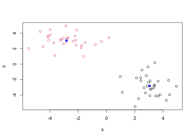
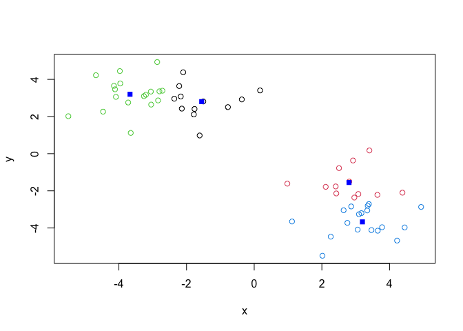
Q. Plot our clustering results with points colored by cluster and also add the cluster centers as new points colored blue?
plot(x,col=km$cluster)
points(km$centers, col="blue",pch=15)
Q. Run
kmeans()again and this time produce 4 clusters and call your result objectk4
k4 <- kmeans(x, 4)
plot(x, col= k4$cluster)
points(k4$centers, col="blue", pch=15)
The metric
k4$tot.withinss
[1] 77.10121
Q. Let’s try different number of K(centers) from 1 to 30 and see what the best result is?
ans <- NULL
for (i in 1:30){
ans <- c(ans, kmeans(x,centers = i)$tot.withinss)
}
ans
 [1] 1175.395784  144.003560  110.552385  100.387746   91.840272   59.692147
 [7]   50.051802   40.980034   40.985596   35.809693   28.538243   29.928725
[13]   19.349694   21.391764   24.792929   14.511127   20.430834   16.142912
[19]   11.008448   11.559613    9.971152    8.185676    7.569056    8.485052
[25]    6.375357    5.643409   12.995677    6.918082    4.571490    3.937595
plot(ans,typ= "o")
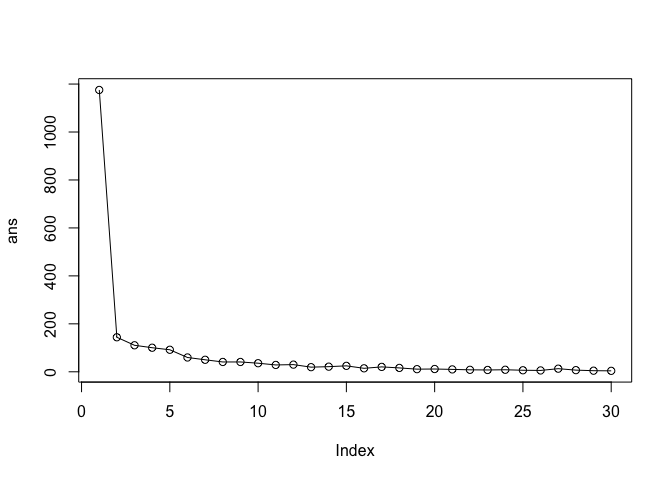
tot.withnss shows how tight the cluster it is. The lower the value the
tighter the clusters group.
Key-Point: K-means will impose a clustering structure on your data even if it is not there - it will always give you the answer you asked for even if that answer is silly!
Hierarchical Clustering
The main function for Hierarchical Clustering is called hclust().
Unlike kmeans() (which does all the work for you) you can’t just pass
hclust() our raw input data. It needs a “distance matrix” like the one
returned from the dist() function.
d <- dist(x)
hc <- hclust(d)
plot(hc)
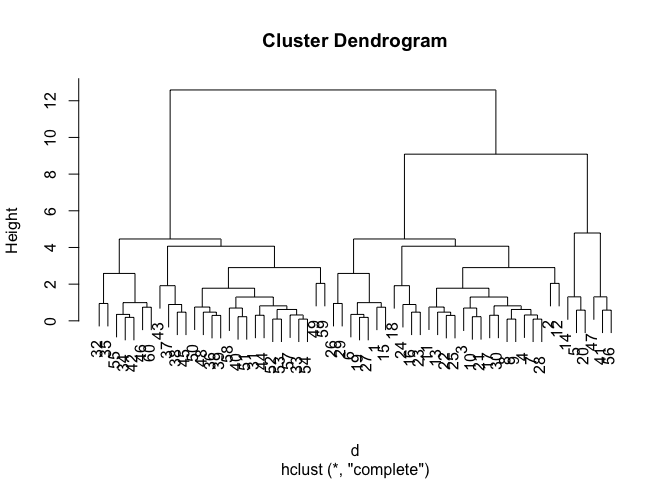
To extract our cluster membership vector from a hclust() result object
we have to “cut” our tree at a given height to yield separate
“groups”/“branches”.
To do this we use the cutree() function on our hclust() objection:
grps <- cutree(hc,h=8)
grps
 [1] 1 1 1 1 2 1 1 1 1 1 1 1 1 2 1 1 1 1 1 2 1 1 1 1 1 1 1 1 1 1 3 3 3 3 3 3 3 3
[39] 3 3 2 3 3 3 3 3 2 3 3 3 3 3 3 3 3 2 3 3 3 3
table(grps, km$cluster)
grps  1  2
   1 27  0
   2  3  3
   3  0 27
PCA of UK food data
Import the data set of food consumption in the UK
url <- "https://tinyurl.com/UK-foods"
x <- read.csv(url)
x
                     X England Wales Scotland N.Ireland
1               Cheese     105   103      103        66
2        Carcass_meat      245   227      242       267
3          Other_meat      685   803      750       586
4                 Fish     147   160      122        93
5       Fats_and_oils      193   235      184       209
6               Sugars     156   175      147       139
7      Fresh_potatoes      720   874      566      1033
8           Fresh_Veg      253   265      171       143
9           Other_Veg      488   570      418       355
10 Processed_potatoes      198   203      220       187
11      Processed_Veg      360   365      337       334
12        Fresh_fruit     1102  1137      957       674
13            Cereals     1472  1582     1462      1494
14           Beverages      57    73       53        47
15        Soft_drinks     1374  1256     1572      1506
16   Alcoholic_drinks      375   475      458       135
17      Confectionery       54    64       62        41
Q1. How many rows and columns are in your new data frame named x? What R functions could you use to answer this questions?
dim(x)
[1] 17 5
One soltion to set the row names is by hand…
#rownames(x)
rownames(x) <- x[,1]
To remove the first column I can use the minus index trick
x <- x[,-1]
x
                    England Wales Scotland N.Ireland
Cheese                  105   103      103        66
Carcass_meat            245   227      242       267
Other_meat              685   803      750       586
Fish                    147   160      122        93
Fats_and_oils           193   235      184       209
Sugars                  156   175      147       139
Fresh_potatoes          720   874      566      1033
Fresh_Veg               253   265      171       143
Other_Veg               488   570      418       355
Processed_potatoes      198   203      220       187
Processed_Veg           360   365      337       334
Fresh_fruit            1102  1137      957       674
Cereals                1472  1582     1462      1494
Beverages                57    73       53        47
Soft_drinks            1374  1256     1572      1506
Alcoholic_drinks        375   475      458       135
Confectionery            54    64       62        41
A better way to do this is to set the row names to the first collumn
with read.csv()
x <- read.csv(url, row.names = 1)
x
                    England Wales Scotland N.Ireland
Cheese                  105   103      103        66
Carcass_meat            245   227      242       267
Other_meat              685   803      750       586
Fish                    147   160      122        93
Fats_and_oils           193   235      184       209
Sugars                  156   175      147       139
Fresh_potatoes          720   874      566      1033
Fresh_Veg               253   265      171       143
Other_Veg               488   570      418       355
Processed_potatoes      198   203      220       187
Processed_Veg           360   365      337       334
Fresh_fruit            1102  1137      957       674
Cereals                1472  1582     1462      1494
Beverages                57    73       53        47
Soft_drinks            1374  1256     1572      1506
Alcoholic_drinks        375   475      458       135
Confectionery            54    64       62        41
Q2. Which approach to solving the ‘row-names problem’ mentioned above do you prefer and why? Is one approach more robust than another under certain circumstances?
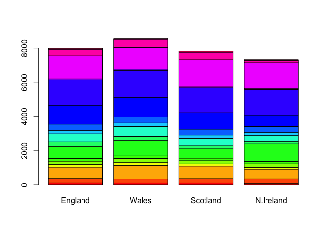
Spotting major differences and trends
barplot(as.matrix(x), beside=T, col=rainbow(nrow(x)))
barplot(as.matrix(x), beside=F, col=rainbow(nrow(x)))
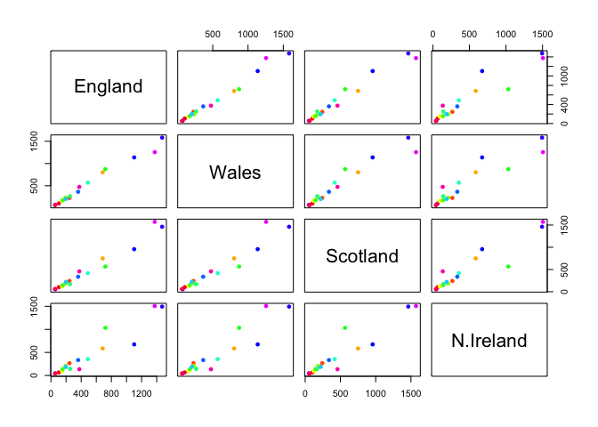
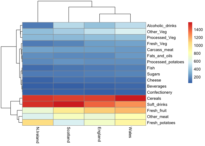
Pairs plots and heatmaps
pairs(x, col=rainbow(nrow(x)), pch=16)
library(pheatmap)
pheatmap( as.matrix(x) )
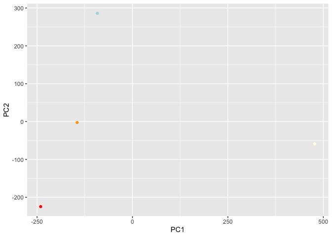
PCA to the rescue
The main PCA function in “base R” is called prcomp(). This function
wants the transpose of our food data as input (i.e. the foods as columns
and the countries as rows).
pca <- prcomp(t(x))
summary(pca)
Importance of components:
                            PC1      PC2      PC3       PC4
Standard deviation     324.1502 212.7478 73.87622 3.176e-14
Proportion of Variance   0.6744   0.2905  0.03503 0.000e+00
Cumulative Proportion    0.6744   0.9650  1.00000 1.000e+00
attributes(pca)
$names
[1] "sdev"     "rotation" "center"   "scale"    "x"

$class
[1] "prcomp"
To make one of main PCA result figures we turn to pca$x the scores
along our new PCs. This is called “PC plot” or “score plot” or
“Ordination plot” …
library(ggplot2)
my_cols <- c("orange", "red", "lightblue", "lightyellow")
ggplot(pca$x)+ aes(PC1,PC2, label= rownames(pca$x)) +
  geom_point(col= my_cols)
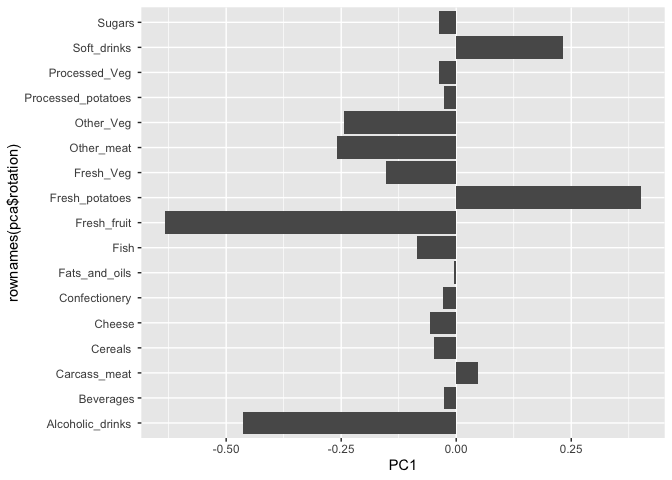
the second major result figure is called a “loadings plot” of “variable contributions plot” or “weight plot”
ggplot(pca$rotation) +
  aes(PC1,rownames(pca$rotation)) +
  geom_col()