Portfolio
classwork for bimm143
Class18
Eric Wang A17678188
- Background
- Investigating pertussis cases by year
- CMI-PB project
- Focus on “PT” Pertusisis Toxin antigen
Background
Pertussis (a.k.a. whooping cough) is a common lung infection caused by the B. Pertussis. It is a bacterial disease.
This can infect all ages but is most sever for those under 1 year of age.
The CDC track the number of reported cases in US:
We can “scrape” this data with the datapasta package
Investigating pertussis cases by year
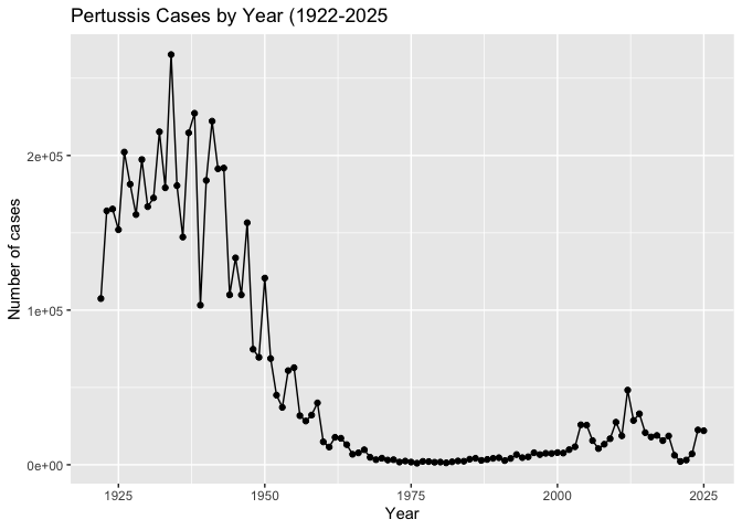
Q1. Use ggplot to make a plot of cases numbers over time.
cdc <- data.frame(
                                 year = c(1922L,1923L,1924L,1925L,
                                          1926L,1927L,1928L,1929L,1930L,1931L,
                                          1932L,1933L,1934L,1935L,1936L,
                                          1937L,1938L,1939L,1940L,1941L,1942L,
                                          1943L,1944L,1945L,1946L,1947L,
                                          1948L,1949L,1950L,1951L,1952L,
                                          1953L,1954L,1955L,1956L,1957L,1958L,
                                          1959L,1960L,1961L,1962L,1963L,
                                          1964L,1965L,1966L,1967L,1968L,1969L,
                                          1970L,1971L,1972L,1973L,1974L,
                                          1975L,1976L,1977L,1978L,1979L,1980L,
                                          1981L,1982L,1983L,1984L,1985L,
                                          1986L,1987L,1988L,1989L,1990L,
                                          1991L,1992L,1993L,1994L,1995L,1996L,
                                          1997L,1998L,1999L,2000L,2001L,
                                          2002L,2003L,2004L,2005L,2006L,2007L,
                                          2008L,2009L,2010L,2011L,2012L,
                                          2013L,2014L,2015L,2016L,2017L,2018L,
                                          2019L,2020L,2021L,2022L,2023L,2024L,2025L),
         cases = c(107473,164191,165418,152003,
                                          202210,181411,161799,197371,
                                          166914,172559,215343,179135,265269,
                                          180518,147237,214652,227319,103188,
                                          183866,222202,191383,191890,109873,
                                          133792,109860,156517,74715,69479,
                                          120718,68687,45030,37129,60886,
                                          62786,31732,28295,32148,40005,
                                          14809,11468,17749,17135,13005,6799,
                                          7717,9718,4810,3285,4249,3036,
                                          3287,1759,2402,1738,1010,2177,2063,
                                          1623,1730,1248,1895,2463,2276,
                                          3589,4195,2823,3450,4157,4570,
                                          2719,4083,6586,4617,5137,7796,6564,
                                          7405,7298,7867,7580,9771,11647,
                                          25827,25616,15632,10454,13278,
                                          16858,27550,18719,48277,28639,32971,
                                          20762,17972,18975,15609,18617,
                                          6124,2116,3044,7063,22538,21996)
       )
head(cdc)
  year  cases
1 1922 107473
2 1923 164191
3 1924 165418
4 1925 152003
5 1926 202210
6 1927 181411
library(ggplot2)

ggplot(cdc) + aes(year, cases) + geom_point() + geom_line() + labs(x="Year", y = "Number of cases", title = "Pertussis Cases by Year (1922-2025")
Q. Add some jaor milestones including the first wP vaccine roll-out (1946), the switch to the newer aP vaccine 1996, the COVID years (2020)
ggplot(cdc) + aes(year, cases) + geom_point() + geom_line() + labs(x="Year", y = "Number of cases", title = "Pertussis Cases by Year (1922-2025") + geom_vline(xintercept=1946, col="lightblue", lty=2)+
geom_vline(xintercept=1996, col="lightyellow", lty=2) +

  geom_vline(xintercept=2020, col= "green",lty = 2)
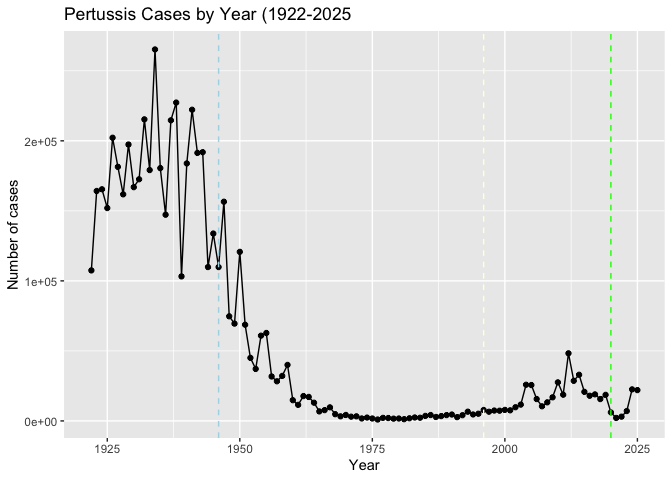
There were high case numbers in the pre 1940s, they were reduced dramatically due to the introduction of the first vaccine. After the the aP was introduced but it worked differently from wP. It introduced protection but it showed that the protect wore off faster than wP.
Why is this vaccine-preventable disease on the upswing? To answer this question we need to investigate the mechanisms underlying waning protection against pertussis. This requires evaluation of pertussis-specific immune responses over time in wP and aP vaccinated individuals.
CMI-PB project
Computational Models of Immunity - Pertussis Boost project aims to provide the scientific community with this very information.
They make their data available via JSON format returning API. We can
read this in R with the read_json() function from the jsonlite
package:
library(jsonlite)

subject <- read_json("https://www.cmi-pb.org/api/v5_1/subject", simplifyVector = TRUE)

head(subject)
  subject_id infancy_vac biological_sex              ethnicity  race
1          1          wP         Female Not Hispanic or Latino White
2          2          wP         Female Not Hispanic or Latino White
3          3          wP         Female                Unknown White
4          4          wP           Male Not Hispanic or Latino Asian
5          5          wP           Male Not Hispanic or Latino Asian
6          6          wP         Female Not Hispanic or Latino White
  year_of_birth date_of_boost      dataset
1    1986-01-01    2016-09-12 2020_dataset
2    1968-01-01    2019-01-28 2020_dataset
3    1983-01-01    2016-10-10 2020_dataset
4    1988-01-01    2016-08-29 2020_dataset
5    1991-01-01    2016-08-29 2020_dataset
6    1988-01-01    2016-10-10 2020_dataset
Q. How many wP and aP individuals are in this
subjecttable?
table(subject$infancy_vac)
aP wP
87 85
Q. What is the biolgoical sex breakdown?
table(subject$biological_sex)
Female   Male
   112     60
Q. What is the breakdown of race and biological sex
table(subject$race, subject$biological_sex)
                                            Female Male
  American Indian/Alaska Native                  0    1
  Asian                                         32   12
  Black or African American                      2    3
  More Than One Race                            15    4
  Native Hawaiian or Other Pacific Islander      1    1
  Unknown or Not Reported                       14    7
  White                                         48   32
Let’s read some more databse tables:
specimen <- read_json("https://www.cmi-pb.org/api/v5_1/specimen", simplifyVector = TRUE)

ab_titer <- read_json("https://www.cmi-pb.org/api/v5_1/plasma_ab_titer", simplifyVector = TRUE)
head(specimen)
  specimen_id subject_id actual_day_relative_to_boost
1           1          1                           -3
2           2          1                            1
3           3          1                            3
4           4          1                            7
5           5          1                           11
6           6          1                           32
  planned_day_relative_to_boost specimen_type visit
1                             0         Blood     1
2                             1         Blood     2
3                             3         Blood     3
4                             7         Blood     4
5                            14         Blood     5
6                            30         Blood     6
head(ab_titer)
  specimen_id isotype is_antigen_specific antigen        MFI MFI_normalised
1           1     IgE               FALSE   Total 1110.21154       2.493425
2           1     IgE               FALSE   Total 2708.91616       2.493425
3           1     IgG                TRUE      PT   68.56614       3.736992
4           1     IgG                TRUE     PRN  332.12718       2.602350
5           1     IgG                TRUE     FHA 1887.12263      34.050956
6           1     IgE                TRUE     ACT    0.10000       1.000000
   unit lower_limit_of_detection
1 UG/ML                 2.096133
2 IU/ML                29.170000
3 IU/ML                 0.530000
4 IU/ML                 6.205949
5 IU/ML                 4.679535
6 IU/ML                 2.816431
To analyze this data we need to first “join”(merge/link) the different tables so we have all the data in one place not spread across different tables.
We can use the *_join() family of functions from dplyr to do this.
library(dplyr)
Attaching package: 'dplyr'

The following objects are masked from 'package:stats':

    filter, lag

The following objects are masked from 'package:base':

    intersect, setdiff, setequal, union
meta <- inner_join(subject, specimen)
Joining with `by = join_by(subject_id)`
head(meta)
  subject_id infancy_vac biological_sex              ethnicity  race
1          1          wP         Female Not Hispanic or Latino White
2          1          wP         Female Not Hispanic or Latino White
3          1          wP         Female Not Hispanic or Latino White
4          1          wP         Female Not Hispanic or Latino White
5          1          wP         Female Not Hispanic or Latino White
6          1          wP         Female Not Hispanic or Latino White
  year_of_birth date_of_boost      dataset specimen_id
1    1986-01-01    2016-09-12 2020_dataset           1
2    1986-01-01    2016-09-12 2020_dataset           2
3    1986-01-01    2016-09-12 2020_dataset           3
4    1986-01-01    2016-09-12 2020_dataset           4
5    1986-01-01    2016-09-12 2020_dataset           5
6    1986-01-01    2016-09-12 2020_dataset           6
  actual_day_relative_to_boost planned_day_relative_to_boost specimen_type
1                           -3                             0         Blood
2                            1                             1         Blood
3                            3                             3         Blood
4                            7                             7         Blood
5                           11                            14         Blood
6                           32                            30         Blood
  visit
1     1
2     2
3     3
4     4
5     5
6     6
abdata <- inner_join(ab_titer, meta)
Joining with `by = join_by(specimen_id)`
head(meta)
  subject_id infancy_vac biological_sex              ethnicity  race
1          1          wP         Female Not Hispanic or Latino White
2          1          wP         Female Not Hispanic or Latino White
3          1          wP         Female Not Hispanic or Latino White
4          1          wP         Female Not Hispanic or Latino White
5          1          wP         Female Not Hispanic or Latino White
6          1          wP         Female Not Hispanic or Latino White
  year_of_birth date_of_boost      dataset specimen_id
1    1986-01-01    2016-09-12 2020_dataset           1
2    1986-01-01    2016-09-12 2020_dataset           2
3    1986-01-01    2016-09-12 2020_dataset           3
4    1986-01-01    2016-09-12 2020_dataset           4
5    1986-01-01    2016-09-12 2020_dataset           5
6    1986-01-01    2016-09-12 2020_dataset           6
  actual_day_relative_to_boost planned_day_relative_to_boost specimen_type
1                           -3                             0         Blood
2                            1                             1         Blood
3                            3                             3         Blood
4                            7                             7         Blood
5                           11                            14         Blood
6                           32                            30         Blood
  visit
1     1
2     2
3     3
4     4
5     5
6     6
Q. What antibody isotypes are measured for these patients?
table(abdata$isotype)
  IgE   IgG  IgG1  IgG2  IgG3  IgG4
 6698  7265 11993 12000 12000 12000
Q> What are the different $dataset values in abdata and what do you notice about the number of rows for the most “recent” dataset?
table(abdata$dataset)
2020_dataset 2021_dataset 2022_dataset 2023_dataset
       31520         8085         7301        15050
It increased compared to the previous two years.
Q. What antigens are reported?
table(abdata$antigen)
    ACT   BETV1      DT   FELD1     FHA  FIM2/3   LOLP1     LOS Measles     OVA
   1970    1970    6318    1970    6712    6318    1970    1970    1970    6318
    PD1     PRN      PT     PTM   Total      TT
   1970    6712    6712    1970     788    6318
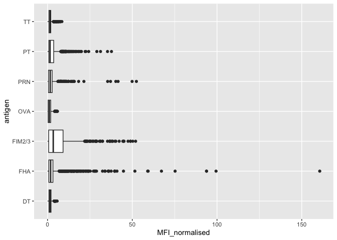
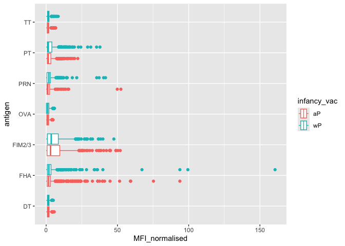
Let’s focus on the IgG isotype and make a plot of MFI_normalized for all antigens.
igg <- abdata %>% filter(isotype=="IgG")
head(igg)
  specimen_id isotype is_antigen_specific antigen        MFI MFI_normalised
1           1     IgG                TRUE      PT   68.56614       3.736992
2           1     IgG                TRUE     PRN  332.12718       2.602350
3           1     IgG                TRUE     FHA 1887.12263      34.050956
4          19     IgG                TRUE      PT   20.11607       1.096366
5          19     IgG                TRUE     PRN  976.67419       7.652635
6          19     IgG                TRUE     FHA   60.76626       1.096457
   unit lower_limit_of_detection subject_id infancy_vac biological_sex
1 IU/ML                 0.530000          1          wP         Female
2 IU/ML                 6.205949          1          wP         Female
3 IU/ML                 4.679535          1          wP         Female
4 IU/ML                 0.530000          3          wP         Female
5 IU/ML                 6.205949          3          wP         Female
6 IU/ML                 4.679535          3          wP         Female
               ethnicity  race year_of_birth date_of_boost      dataset
1 Not Hispanic or Latino White    1986-01-01    2016-09-12 2020_dataset
2 Not Hispanic or Latino White    1986-01-01    2016-09-12 2020_dataset
3 Not Hispanic or Latino White    1986-01-01    2016-09-12 2020_dataset
4                Unknown White    1983-01-01    2016-10-10 2020_dataset
5                Unknown White    1983-01-01    2016-10-10 2020_dataset
6                Unknown White    1983-01-01    2016-10-10 2020_dataset
  actual_day_relative_to_boost planned_day_relative_to_boost specimen_type
1                           -3                             0         Blood
2                           -3                             0         Blood
3                           -3                             0         Blood
4                           -3                             0         Blood
5                           -3                             0         Blood
6                           -3                             0         Blood
  visit
1     1
2     1
3     1
4     1
5     1
6     1
ggplot(igg) +
  aes(MFI_normalised, antigen) +
  geom_boxplot()
Q. Is there a differrence for aP vs wP individuals with these values
ggplot(igg) +
  aes(MFI_normalised, antigen, col = infancy_vac) +
  geom_boxplot()
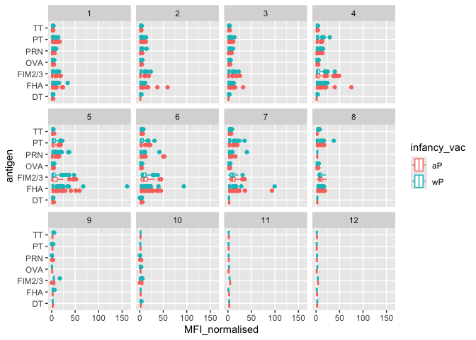
Q. Is there a temporal response - i.e. do values increase or decrease overtime?
ggplot(igg) +
  aes(MFI_normalised, antigen, col = infancy_vac) +
  geom_boxplot() + facet_wrap(vars(visit))
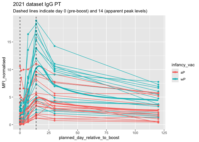
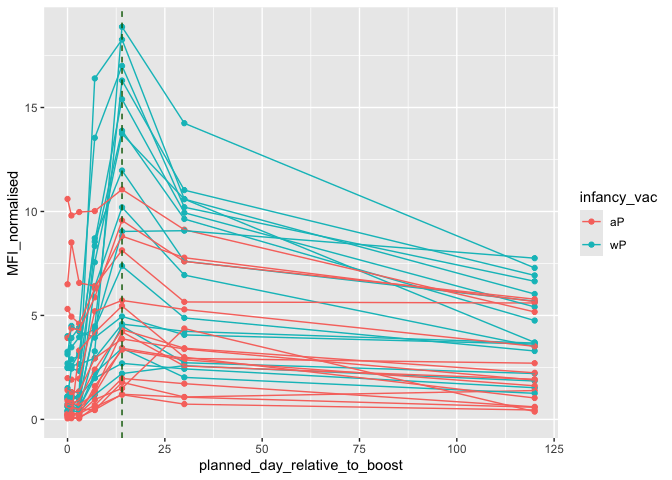
Focus on “PT” Pertusisis Toxin antigen
pt.igg.21 <- igg |> filter(antigen == "PT",
              dataset== "2021_dataset")
ggplot(pt.igg.21) + aes(planned_day_relative_to_boost, MFI_normalised, col = infancy_vac, group = subject_id) + geom_point() + geom_line() + geom_vline(xintercept = 14, col = "darkgreen", lty=2)
abdata.21 <- abdata %>% filter(dataset == "2021_dataset")
abdata.21 %>%
  filter(isotype == "IgG",  antigen == "PT") %>%
  ggplot() +
    aes(x=planned_day_relative_to_boost,
        y=MFI_normalised,
        col=infancy_vac,
        group=subject_id) +
    geom_point() +
    geom_line() + geom_smooth(
  data = abdata.21 %>%
           filter(isotype == "IgG", antigen == "PT"),
  mapping = aes(
      x = planned_day_relative_to_boost,
      y = MFI_normalised,
      color = infancy_vac
  ), se = FALSE,
  linewidth = 1.5,
  inherit.aes = FALSE, span = 0.4
)+
    geom_vline(xintercept=0, linetype="dashed") +
    geom_vline(xintercept=14, linetype="dashed") +
  labs(title="2021 dataset IgG PT",
       subtitle = "Dashed lines indicate day 0 (pre-boost) and 14 (apparent peak levels)")
`geom_smooth()` using method = 'loess' and formula = 'y ~ x'